


 +86-4000-808176
 +8618059761903
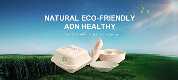


The use of color in food packaging is crucial!
In product packaging, the primary visual element that captures consumer attention is color. In other words, color exerts a captivating effect and charm that precedes others. The use of color in food packaging determines consumers' perception and rapid circulation of product sales. It not only deepens consumers' cognition and memory of the product but also indirectly evokes aesthetic associations and influences consumer psychology.
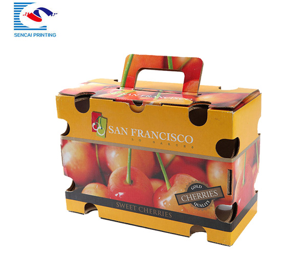
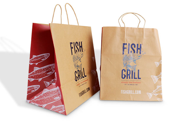
1、Hue contrast. The color contrast effect formed by the difference in hue after combining two or more colors is called hue contrast. Hue contrast can enhance vividness and clarity. High-purity hue contrast effects are more luxurious, bright, lively, and tend to excite, arouse excitement, focus attention, and have a clear emotional tendency. Conversely, low-purity hue contrast effects are weaker. For example, in tobacco and alcohol products, the use of ancient and elegant hue contrast often creates a strong psychological sensation of deliciousness, richness, and fragrance, reflecting the brand's long history.
2、Purity contrast. When two or more colors are combined, the color contrast effect formed due to different purities is called purity contrast. Strong purity contrast can stimulate people's physiology and psychology. On food packaging, strong and bright purity contrast can highlight the flavor and taste of food. For example, foods such as chocolate and oatmeal use warm colors such as gold, red, and coffee as the base tone, applying strong contrast in hue to make people fully feel the deliciousness, freshness, and sweetness of the product. However, colors with relatively weaker purity contrast give people a fresh and elegant feeling. Taking green tea packaging as an example, using weak contrast techniques gives people a fresh and healthy feeling.
3、Brightness contrast. When two or more colors are combined, the color contrast effect formed due to different brightness is called brightness contrast. Brightness contrast is one of the most important factors in color composition. To enhance the contrast effect and visual effect, it is necessary to increase the brightness contrast, otherwise it will be weakened. Brightness contrast can create a sense of hierarchy between colors, thereby enriching and activating the product's image. Brightness contrast directly affects the perception of buyers. The strong and weak contrast of brightness can usually reflect the thickness, lightness, and different levels of taste stimulation of food.
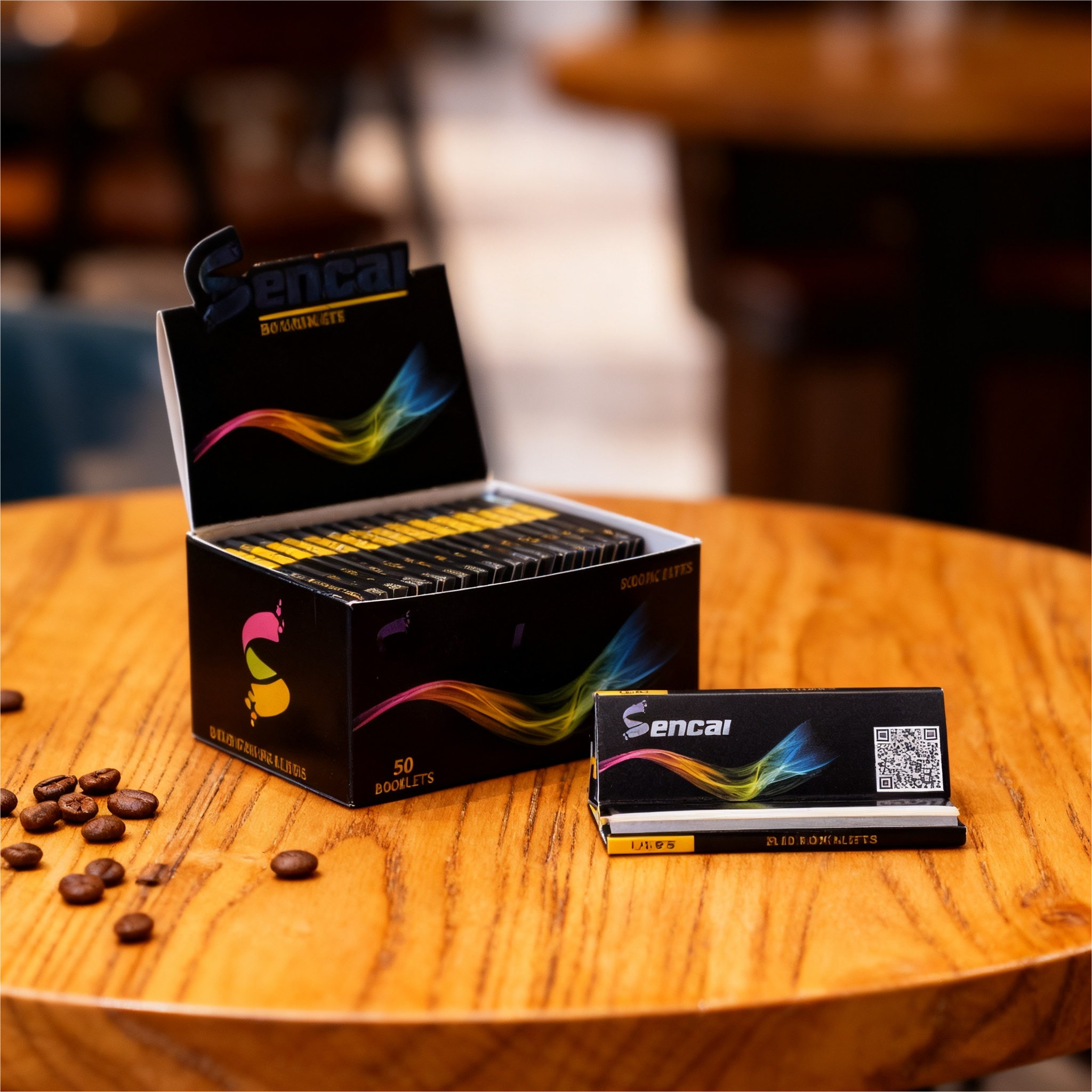
4、Color contrast. The color contrast effect formed by the combination of two or more colors due to different cool and warm tones is called color contrast. In the color contrast of cool and warm tones, the contrast between orange and blue is the most obvious, which can produce a visual sense of advance and retreat and contrast. Warm tones can give people a sense of affinity, while cool tones give people a sense of retreat and distance. Among colors, red, yellow, and orange can make people's heart rate increase and blood pressure rise, giving people a warm and intimate feeling. Blue and purple can slow down people's heart rate, lower blood pressure, and make people feel cold.